Sunday, 25 March 2018

Reflecting upon my mock final outcome and making improvements


I was quite pleased with my mock final outcome as it means that I am beginning to visualise more clearly what my real final outcome will look like. I think that each individual composition has come together to form one outcome well, even though I have used different lines in each one. I think that the acrylic paint in the foreground ties together each photograph as one composition. However, I do think that there needs to be more harmony between each photograph to really fix these together as having the same concept regarding stereotyping and individuality. As there are only small circular marks in my composition,  I think there needs to be some larger ones so that there is a variety of sizes throughout. This would allow me to make mark that overlap between photographs and therefore linking them together. I worked back into my mock final outcome to see if this would work or not. I have used a plate to print a larger circular mark shape over the photograph. I have done this using green and yellow paint as I think these would stand out the most against the other colours that I have used already. I found that using the yellow paint was most effective as it really draws attention to the composition, as well as continuing a positive mood throughout. I don't think that the green worked well as it didn't show up enough against the photograph to really pinpoint a focus on the composition. Also, I am going to place a white board beneath the photographs so that when I print the larger circular marks, they can overlap and link each photograph together. 


As I am exploring the exam stimulus based on the reductive process, I thought that I could exaggerate this to make it clear which stimulus I am responding to. As I have thought about adding larger circular shapes to my outcome, I have removed a section of a circular line from two of the photographs to see if I this would form an effective harmony. After doing this, I think that this provides too much of a clean line and detracts attention from the organic marks that I have made in the foreground of the photographs. Additionally, getting both cuts to be the exact shape on each side is difficult and so the circular line isn't very neat. 


Additionally, I could overlap the wallpaper that I have used in the background with a transfer of the line work that I have done into the newspaper. This would add more depth to each section and create more of a balance between the surfaces that I have used in the background. I have tried doing a celotape transfer of the newspaper so that I could stick it over the wallpaper. I have done this on a small sale to see what it would look like. When I did this, the pink lines haven't shown up very well as it is a lighter colour and so the pigment has been lost. I am going to try photocopying this onto acetate instead and see if the pigment of the colour is still vivid.


Furthermore, the wallpaper that I had used didn't include a wide range of bright colours like I had been using in my developments. This was because the wallpaper that I had been using only had small area of colour in and so wouldn't have filled the areas that I had removed from the photographs. As a result, the wallpapers that I used weren't as effective and I didn't think as closely as to where I was placing theme due to the time constraint. For my exam I have sourced a selection of wallpapers that have large areas of colour so that they will fill the areas that I cut out. Additionally I have got wallpapers which have various bright colours in them so that there is a wide colour palette.


Planning for final outcome and completion of my mock final outcome.


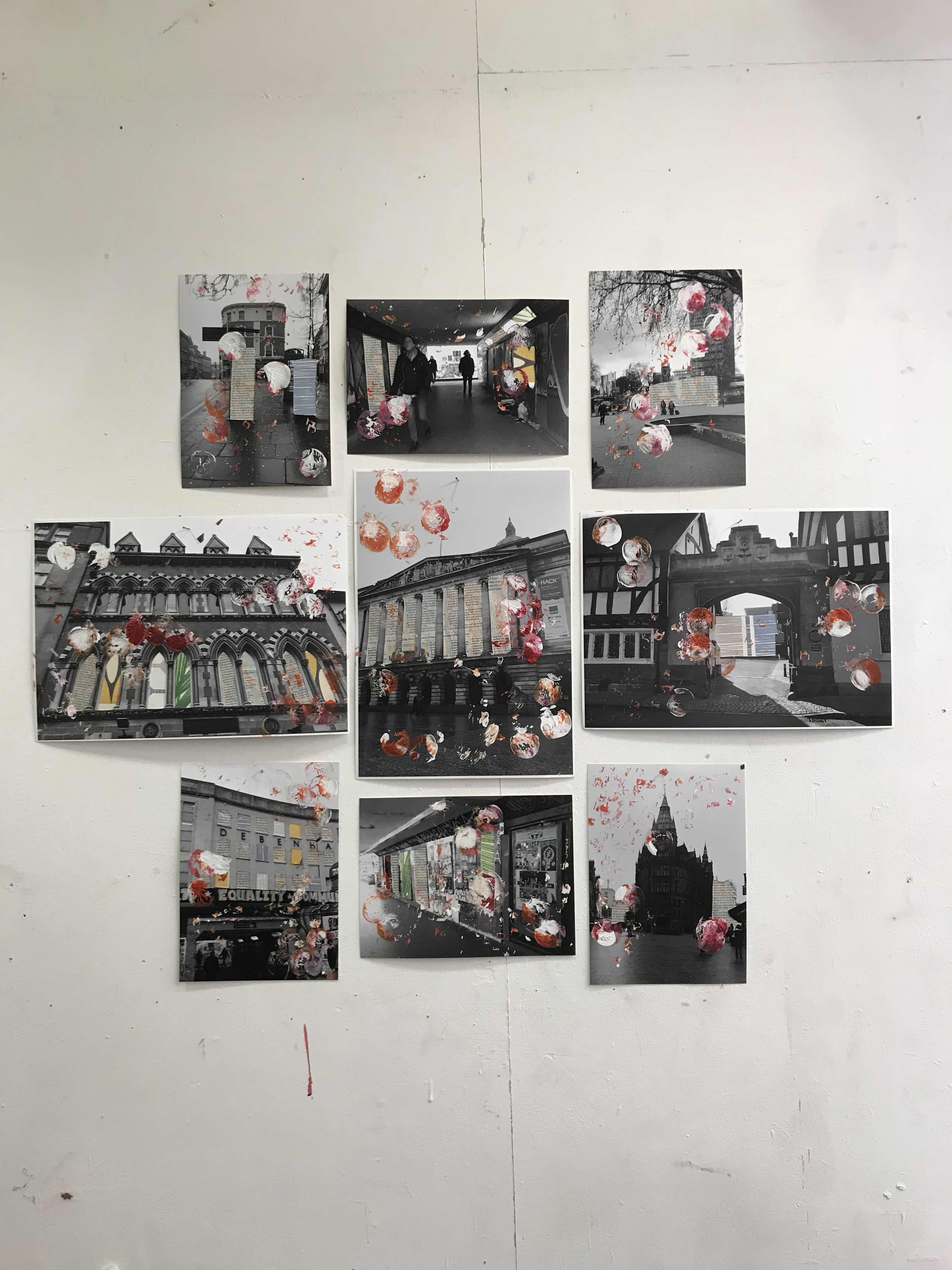
I have been through my sketchbooks looking at my experiments and developments to see what techniques I want to use in my final outcome. I particularly like the responses that I did after seeing Guy Catling's art work. I found that these compositions worked best onto photograph paper as it gave the end result a better quality. I removed sections of the photograph with a knife and laid newspaper beneath it. Adding newspaper means that more tonal variation is brought to the composition. It also means that I can take the work that I had been doing in the style of Tom Phillips, and apply it to the composition. I used line to add subtle colour to certain sections of the photograph so that a harmony is formed between the black and white photo and the acrylic paint that I then added on top. I printed with acrylic paint, circular marks to provide a wholesome mood. Forming circular shapes is important as it means that I can reflect how a person should be seen for their entire personality. I selected to use orange and pink acrylic paint to form a bright warm mood in order to create a celebration of individuality. I have also used white acrylic paint to further brightens the composition as it is prominent against the tonal photograph. I have printed these marks using a milk bottle top. This allows me to make smaller circular marks and also when used on its side, I can makes short straight marks which add flecks of colour and contrasts the circular marks. 


After going through scale and arrangement of my final outcome and seeing which would look best, I have decided to use this 3 A2 size photographs and 6 A3 photographs. I have chosen to work on a large scale so that there is plenty of room for me to work into the photographs without it looking overcrowded. Also when I cut sections of the photograph out, these will be large enough to be significant in the composition, meaning that I can work into the newspaper more which I will lay behind the photo. I decided to arrange several compositions together to form one big outcome as I think that this worked well in Shaun Kardinal's 'Alterations (found and unbound)' which I have spoken about in earlier blog posts. This allows me to represent many individuals and their bright nature, with different organic marks being made on each photograph. I have chosen to use photographs that I have taken on landscapes rather than people to make the outcome less obvious of what it is about. I want the viewer to remain inquisitive as to what the outcome is portraying, this way each person will have their own interpretation of it and therefore their individuality will be discovered from seeing this. 


I set myself a full college day, 5 hours, to execute a mock final outcome. I had already printed the relevant photographs on a size down from what my actual final outcome will be, and so I could work into them straight away. I began by removing sections of each photograph in which I found would provide an obscure shape, give a large area for me to work in beneath or to accentuate another building close by. I then added wallpaper and newspaper beneath each section and worked into the newspaper adding like after being inspired by Tom Phillips to explore 'reductive process' in this way. Adding wallpaper behind provides vibrant sections of colour which starkly contrast the black and white photograph, whilst the line I have added using coloured biro pens adds a less obvious colour. I also used line on the photograph to add subtle colour so that a harmony is formed between the vivid background from the wallpaper, to the tonal photograph and then to the vibrant foreground of acrylic paint. I printed orange, pink and white acrylic paint onto the photographs as I have done before in my developments. 


Monday, 19 March 2018

Exploring more techniques to boost AO2 which I could potentially use in my final outcome

I have looked at combining two techniques that I have used previously in my sketchbook to refine my creative making. I was impressed by how vibrant the colour is that ink provided to my experiments. Therefore, I have applied ink the paper using a loofah to make eccentric and uncontrollable marks to portray the idea of someone being a free spirit. I have used a loofah before to make marks and I chose this item as it was easily accessible to me and so is cheap and one of my artists, Shaun Kardinal, tends to make his visual art as cheaply as possible. I have used a red and yellow ink as these colours are warm and have connotations of happy experiences for most people when used together. For me, these colours remind me of summer and long days. Where I have overlapped these colours, they have mixed and formed the secondary colour, orange which creates a harmony between the two primary colours and makes the composition as a whole look more balanced. I have then used a cotton bud to apply bleach to the surface, writing words which have relevance to my subtheme of stereotyping. Using bleach ensures that I am still using a reductive process in my work and adds a subtle message as the contrast between the ink and bleached area isn’t a very stark one.


Again I have looked at ways that I can portray more subtle messages and so have used a delicate material, wire. I have experimented using wire to form words that are relevant to my subtheme of stereotypes. A thin wire is easier to maniupate as it isn’t as strong but in terms of forming the letters it is incredibly fiddly. The delicate nature would be able to provide a subtle message to my final piece. However, as the wire is grey, I think that it would stand out a lot compared to the array of colours that I will be applying to my final outcome. 


I have tried felting to see how colour is portrayed when using this technique. To do this I have used a pink and yellow felt, wet them with water and rubbed them with soap. I then added an orange piece of thread as I have been using this is my other experiments. Using this also means that there is line present in the overall outcome. I have then rolled the felt in cling film and pushed the excess water out and left it to dry. Once dried, the felt sticks together as one whole piece. I like how the outcome of the experiment looks like an explosion of colour and really emphasises it’s own presence due to its soft but rigid nature. Furthermore, I also like how the felt isn’t in one solid block and so there is space beneath the felt that can be seen. This sense of space adds to how an individual is presenting themselves in a raw manner amongst a society that sterotypically remains inside social boundaries. 


Experimenting using different processes which relate to my theme

I have experimented using Tyvek to see what textures would look like with my theme of stereotypes. Once heating the Tyvek with a heat gun it screws up and makes a bubbly texture. After it has cooled the Tyvek becomes rigid, however it can still be moulder whilst it’s still hot. This is a reductive process because after the heat is applied, the Tyvek is reduced down in size as it form the bobbled texture. This rigid feel reflects how stereotypes are very much set in stone and that it takes a few individuals to start breaking this mould. I have added graphite to the Tyvek as it provides a thicker line than pencil and so is easily noticed. I applied this to the Tyvek using continuous line to reflect the continuation of stereotyping throughout generations. This represents how the knowledge and application of stereotypes have been passed down through generations, this is evident in history where people used to believe that black people were inferior. I have added newspaper to the Tyvek to add a sense of context to the composition to represent how stereotypes only form from given information. I am not pleased with my experiments using Tyvek as I don’t like the texture that it provides as I think it is too harsh. Also using graphite on top means that a darker mood is given off and so doesn’t represent the sense of individuality that I have been trying to portray in my other sketchbooks. 


Additionally I have experimented using brusho as it is very pigmented. I have used it on top of two different surfaces, paper and textured wallpaper. In my first experiment with it I applied a lot of water to the page and so after I sprinkled the brusho over the top, the pigment has become a solid colour and appears more like ink. Whereas, on the next experiment I applied less water to the page and so in some areas the pigment hasn’t dissolved and has left a crumbly texture on the surface. This means that there is more tonal variation within the composition and there is a more exciting mood as there is a wider range of tones of colours on the page. The striking pigmentation in the brusho allows me to put actions the idea of someone’s personality being exciting and so using this medium is effective is displaying a person’s individuality. When using textured wallpaper as the surface I found that the pigment in the brusho appeared duller, perhaps because the wallpaper isn’t brilliant white. Although the wallpaper provides another dimension to the composition, the vibrancy of the colour is lost and so I haven’t continued any further with exploring this technique.


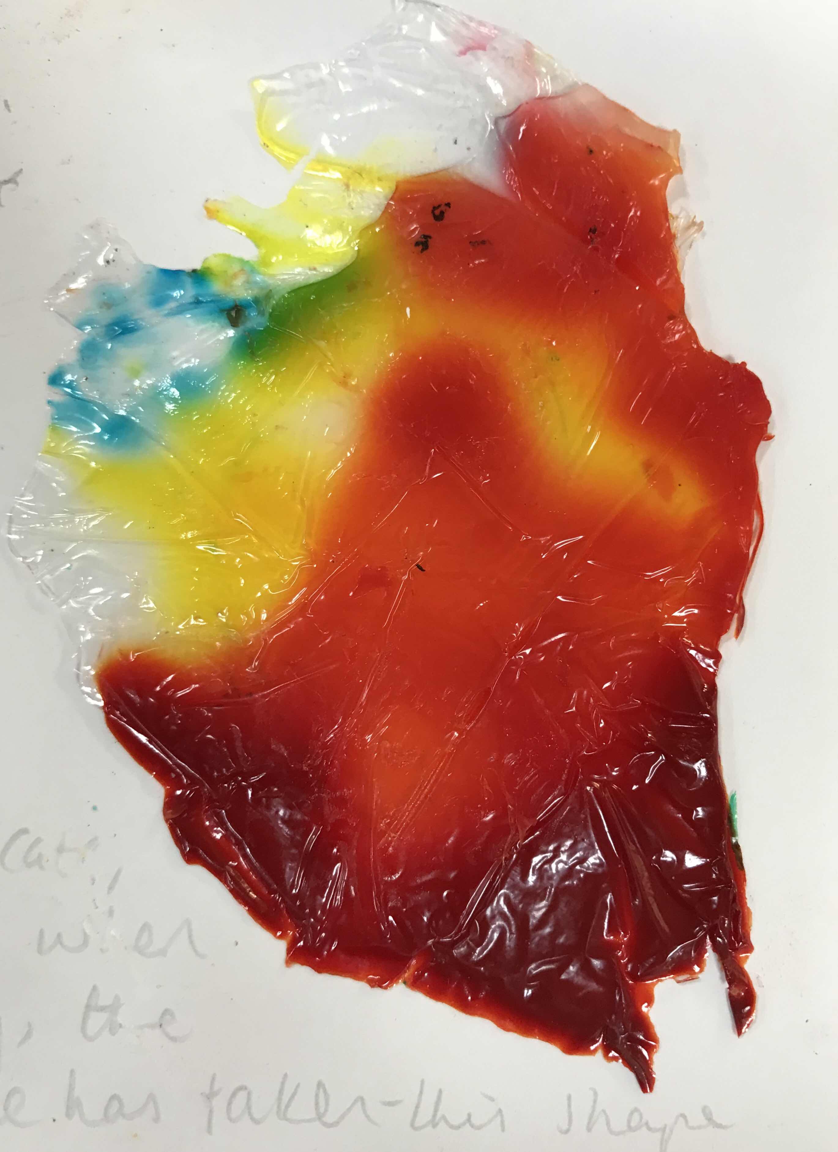
Furthermore, I have experimented the effect that using pva glue and ink together would make. I poured pva glue onto cling film and then poured ink in small quantities onto the glue. This took a couple of days to dry as the pva glue was quite thick. Once it was dry I could peel the glue off the cling film and stick it to a desired surface. As the cling film is delicate, it’s shape is easily manipulated and so when I was transporting it to dry, creases were made in the cling film and therefore the glue has taken this shape whilst drying. I prefer the experiments that I did using red and yellow ink rather than green and blue as these colours  are warmer and more clearly emphasise the vivid warmth of someone’s personality. Colour being vibrant is important so that I can display to the viewer how people emerge from their stereotypes and don’t abide by them. 


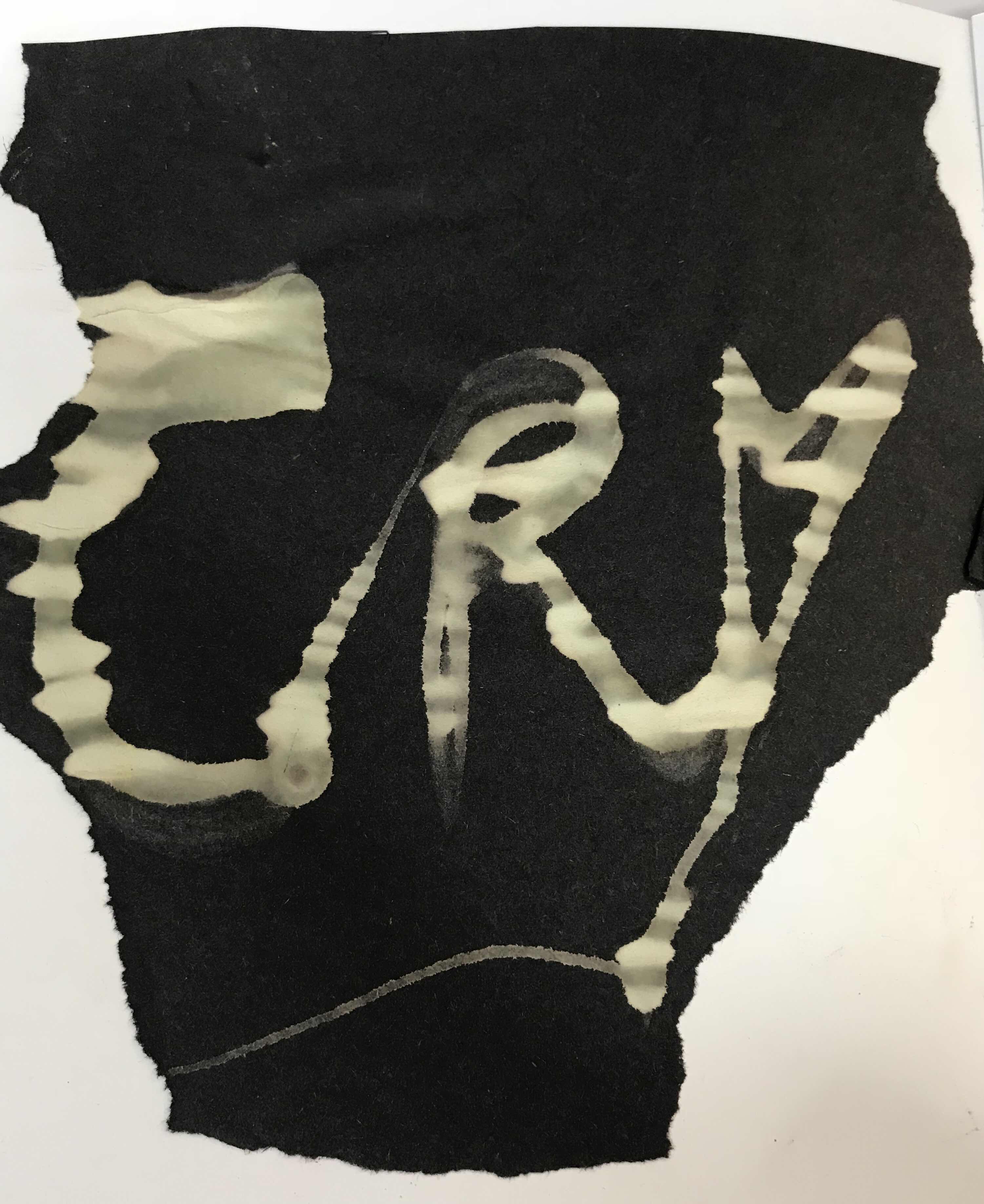
Moreover I have explored the reductive process by using bleach as this removes any dye from surfaces. I have experimented using bleach onto surfaces like fabric and sugar paper. Firstly I put bleach onto fabric to see what effect it would have on it. The area where the bleach was applied has become yellow/orange with is prominent against the original grey of the fabric. After viewing how bleach worked on the fabric, I tried to manipulate the bleach to spell out a word that is relevant to my theme. I chose the word ‘cry’ as it is short and can easily be written onto small experiments.  Using ‘cry’ displays how I am trying to convey how men should feel that they are able to show their emotion without feeling ashamed. Also I have used this word in several other experiments which allows me to compare it to other techniques that I have previously used. When I put the bleach onto the fabric by pouring it slowly out of a pot, the line was very thin, however the fabric absorbed the bleach and so it has become thicker whilst drying. I therefore has little control over line thickness when working onto fabric. Conversely, when forming the word again onto sugarpaper the line was the same thickness as when I applied it as this surface is less absorbent. The bleach has turned the black sugar paper a tint of green. Within the lettering there is a lot of tonal variation where the paper has absorbed the bleach in different amounts. I chose the use continuous line when writing ‘cry’ to represent how this emotion should be freely expressed without care towards people mocking you for defying the ‘masculine’ stereotype of not crying in public.


Wednesday, 14 March 2018

Scale for final piece

I have looked at what scale I am going to work on for my final piece. I have done this by putting up sheets of black paper on the wall to enable me to see what scale would look best. By picturing my work in these different arrangements it has lead me to think about the practicalities of using photography in my final outcome. 


A large A1 final outcome would be incredibly striking, especially when using bright colours that I have been in my experiments and developments. Additionally, a large scale would allow me to incorporate more of my next techniques as it provides a large surface area for it not to appear muddled or crowded. This size is the largest that the printer will print a photograph.


Furthermore, I have put up three A2 black sheets of paper to visualise my work on. I have stuck these portrait as many of my photographs are portrait. I selected to hang three sheets as an odd number is most aesthetically pleasing. 


Moreover, as I have been looking at Shaun Kardinal I wanted to look at using multiple pieces of work to create one large composition. I have looked at using different sized individual pieces. I’ve placed smaller scale pieces of my work onto the paper so that I could imagine my work on the wall. At the moment I think that this arrangement looks most interesting as it has different scales and multiple compositions included in it. 

Tuesday, 13 March 2018

Responding to Shaun Kardinal and how I can apply this to my Catling responses

I have taken a series of photographs of my brother which I decided to use as he represents one of the main male figures in my family. I have explored ways of using embroidery as Shaun Kardinal does to try and portray my theme of negative stereotyping and challenging this concept. To carry on investigating the reductive process whilst sewing thread into my photographs, I have selected a large needle so that it pierces large holes than necessary in the surface.


In this composition I have combined Kardinal's embroidery techniques and Kruger's use of words to emphasise the theme of stereotyping. I have sewn the word 'strong' across the top of the photograph to portray how society believes a man should be. I chose a blue thread as this colour typically has male connotations and so this helps to accentuate that the composition is surrounding the male gender. As the holes that the needle has created are quite large, a disjointed feel is brought to the lettering. This adds to reflect that I am challenging this idea of men behaving in such a way as the lettering appears almost broken. I chose to stitch this word over a photograph where Richard's head is turned to the side as it portrays how society expects men to turn a blind eye to their emotions and keep them at bay. Richard has a slight smile on his face which reveals how men are 'supposed' to seem like everything is ok and uphold a strong exterior.


Rather than looking at applying words onto my photographs, I have also investigated shape.  I have used the thread to create linear line to build a shape over the mouth area. I selected this area to cover as it seals the lips from speaking about emotions and feelings. I wanted to make the viewer question the shape on the photograph and so I have made an obscure bow tie shape to reflect a traditional ideology of men keeping their emotions to themselves. However,  have skewed the shape to present how I am trying to challenge this idea and how many other people are beginning to realise this too. Additionally, I chose a softer blue thread to connote how this issue has been laying in the background for some time. This is because this tint of blue is soft like the other colours in the photograph, especially the lighting.

Furthermore, reflecting upon the artist Shaun Kardinal and how I have applied his techniques to my own work - by sewing words that are relevant to my concept,like 'cry', into my own photographs. i have colcuded that these experiments didn't progress as I envisaged. However, I began to look at how Kardinal arranged his work. His arrangements have influenced me greatly as he fuses together several compositions to make one larger one. This could use this idea to allowe me to bring together many compositions to reflect how we should all be together as one. This message would be subtle but I want to make the viewer inquisitive as to what is meant. Moreover, I think this subtle message would also allow the viewer to take a personal stance as to what my concept is, which is important as I want to draw out everybody's uniqueness.

Thursday, 8 March 2018

Refining Catling responses using visual influence from Yuji Hamada

I was reading a book based on photography seeing as I have been working into my own photographs to produce responses from my artists. I came across Yuji Hamada who is a Japanese photographer and questions what it means to see. He is fascinated by what is represented in a flat image and alters his photographs to do this. 'His approach is that of an excavator' - which reflects how he uses a reductive process to create his artwork. (quote taken from the book I read). Hamada takes apart the fibres of a photograph with tweezers, separating the cyan, magenta and yellow layers of a digital Polaroid. To make this easier, he soaks the photographs in water three or four times so that the layers easily pull apart.


As I do not have access to a Polaroid camera, I have decided to alter this process by using a printing technique as I have already explored one already - screenprinting. I have looked at printing acrylic paint onto the compositions that I made when responding to Guy Catling using household objects. I took a photograph of an old lamppost on Spon Street whilst in Coventry as I thought its shape was uniquel. To emphasise this I have selected this part to remove and add colour and pattern to it. As there is foliage in the background, I chose a wallpaper with in so that there is harmony throughout the composition. As I took the photo so that the lamppost perfectly divided it, I ma representing how stereotypes divide groups of people and segregate them form each other. The light blue colour of the wallpaper reflects how many people are calm and settled about this division happening in society. This is because the cool colour connotes a settled mood and one of no change. I have printed with orange over the top to contrast this colour and idea to show how there should be a change within society based on stereotyping.


I wanted to change the way that black and white and colour is portrayed in terms of layering. I have done this by using a colour photograph and newspaper. The paint over the top of this composition further emphasises the bright colours that are provided from the graffiti. ASs graffiti is usually seen as a rogue art form, I wanted to juxtapose this by adding more delicate marks to defy the stereotype. I wanted to make a more compelling shape with the photograph and so I have cut away a large majority of it. This reflects the diversity of a person and how individuality should be celebrated.

Responding to Guy Catling - major turning point in my Component 2

In my experiments I have adapted Guy Catling's way of working to align with my chosen stimulus - reductive process. Catling adds fabric to sections of black and white images, but I have altered this technique by removing sections of photographs and placing a patterned wallpaper beneath. I have sourced wallpaper as it can be easily collected, cheaply too. Using wallpaper creates more of a unison with the photograph as they have similar qualities, for example, a smooth texture. Catling gives a new meaning to the images that he works on top of and so I want to do the same in relation to my concept of defying stereotypes. This should be achievable as adding an element of colour instantly changes the visual appearance and mood of the compositions.


Catling has done a series of compositions which include people in the photographs. In this experiment I have cut out two figures of people so that I could stick patterned wallpaper beneath it. Doing this represents the individual's colourful, vibrant personality that you don't see when passing a stranger in the street. This is therefore emphasising how people are quick to judge someone based on their appearance. This composition accentuates a person's private self which is bright and interesting through the application of rich colours in the background. The amount of colour in this composition is sparse and so this focusses the attention to the figures as the colours are striking against the tonal photograph. Additionally, in terms of shape, this composition is quite rectangular due to the features of the building. This rigid nature reflects the structure of a stereotype and how they can be hard to shatter. As the people are different shapes it shows us how our society is diverse and doesn't align with these geometric structures that are surrounding us. Therefore, we shouldn't try to make people fit into groups and stereotype them as we were born as individuals.


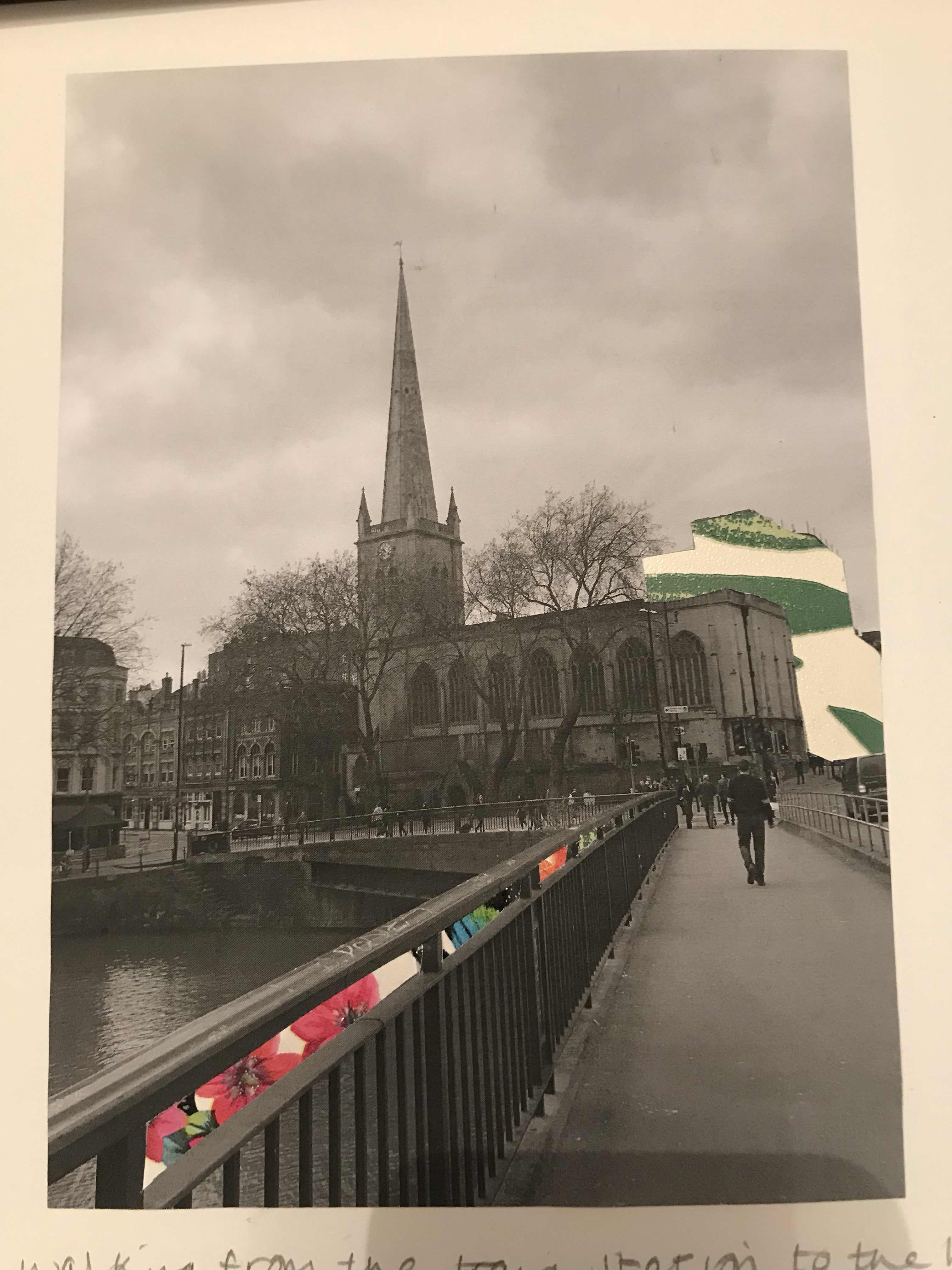
Whilst walking from the train station to the hotel, we walked past the church that is in the photograph. This stood out as the spire was so immense and the shape of this was completely different to the other buildings. As this caught my eye, I wanted to draw the viewer's eye to the church, especially as I don't see many churches with spires and was so fixated on it. To do this I have removed the hollow parts between the railings on the bridge and put wallpaper behind them so that the colour and direction leads the eye up the composition. I first stuck a bright pink wallpaper behind it so that this rich colour draws attention, then I added blue to contrast the colour palettes in terms of hot and cold colours. Following this I used orange to contrast the blue and then a green to create a unity between all the sections as some parts have hints of green in. As the shape of the church on the right had been lost due to the photograph being quite dark, I wanted to emphasise the size of it and so I removed the building behind it. I chose to line it with green wallpaper so that the green in the railings was continued up to the church, therefore leading the viewer's eye that way. I have thoroughly thought about my placements in  colour and I think that I have been able to focus the viewer's eye well whilst doing so. As well as using colour, this formed a line upwards towards the church and so this created a movement in which the eye would follow. Therefore my application of colour has also formed line. There isn't too much colour in this composition, I think I have struck a balance between colours and shades as there is just enough colour to have an impact on the viewer without overwhelming the piece.

Tuesday, 6 March 2018

Focussing on male stereotypes when working into my photographs

After reading an article publishes by The Sun regarding the Armed Forces 'going soft', I was inspired to respond to this statement.
Link to article:
https://www.thesun.co.uk/news/5307683/british-army-advert-campaign-emotional-support-solider-political-correctness/

I have responded to this article by reflecting both sides of the argument; how a 'man' should typically behave and the 'softer' side to the male representation of a soldier. I have done this by using the technique of cutting out words into photographs. I decided to cut into photographs from my Dad's service in the British Army as these photographs are personal to my family and so have relevance to me. These also instantly provide a monochrome background which is prevalent within Barbara Kruger's artwork. I wanted to portray both sides of the way a man 'should' behave and so I have completed two experiments based on each persona. For example, I cut out 'man' and 'be a man' into two photographs and 'cry' and 'emotion' into the others. I have painted red acrylic paint behind these so that the red adds a sharp injection of colour. As the colour red has opposing connotations of danger and love, this colour is suitable to use in both instances. The new British Army advert promotes how it is acceptable to express emotion, as well as belong to minority groups, like being gay. The adverts are opposing the stereotype of the traditional male and I believe that this is a big step for our country. Additionally, a wider force has contributed to opposing this stereotype, like Paloma Faith addressing this issue in her latest album.


Returning back to working into the photographs that I had taken myself, I have now looked at using my Dad's Army photographs in a different way. Adding these photographs into the background makes the general theme of military more evident to the viewer. It is also means that there is more tonal variation within the composition as the photo is black and white. I chose to photograph my friend, Evan, as he wants to join the British Armed Forces, specifically the RAF. Therefore I have cut different size squares out around his head to represent the confusion that has been made surrounding the mindset of a soldier. Although the new campaign promotes an emotional diverse male, the transition from the old traditional mindset to the new one will take a lot of time. Therefore, I chose to remove squares from the photograph in the foreground to present a pixilation between traditional and modern man. The expression on Evan's face further accentuates this transition a he looks despondent and so doesn't know how to portray himself. Furthermore, I have folded the centre of the squares over to add a stark contrast between, not only colour, but between the old soldier beneath and the new generation of Armed Forces personnel. Additionally, I took this photograph with a red gel over the lens and so there is a subtle presence of colour which means this experiment still coincides with my colour palette.


Monday, 5 March 2018

Portrait photoshoot and working into them

As Kruger works onto portraits, I did a photoshoot of my two friends in the art studio to add some photography to my Component 2. This means I am using first hand sources to drive my experiments forward. I took the photos with a black background as I think this fits better with my theme in terms of the issue of stereotyping still being quite hidden in the dark. Furthermore, this means that my photographs aren't extremely bright and there is a contrast between the complexion of my friends' skin and the background. If I took these photographs on a white background, I think that they would've looked too bright and cheerful. Whereas a black background allows me to capture the duller feel that Kruger's images have. I also experimented with placing a red gel over the lens and over the lights in the studio to give a subtle red tinge to my photographs, therefore still continuing to use the same colour palette. I think these photographs were the most successful as it places a film of colour over the subject's face, which presents how a stereotype is placed onto an individual and someone's perception of another can become distorted because of this stereotype.

I started to work into these photographs using a reductive process, whereby I cut relevant words into them. I took words such as 'kind' to represent a woman as this was a word that I found in an article based on women and their behaviour. In the first experiment below, I wanted to keep the lettering large to make the word evident in portraying the attributes of the lady. This word is not shocking in any way as this is a word that most people would expect to see in align with a female. As the lettering is so large, this mean that I had to arrange each letter not in the usual, straight left-to-right fashion. Instead, I have directed the word down the right had side of the photograph, ensuring that the lettering remains separate from the subject. I have kept these two elements of image and lettering separate to represent how a word can easily be dissociated from an individual and how we have the potential to remove a stereotype from a person. As the white page beneath the photograph can now be seen, a stark contrast has become available and so it draws the attention of the viewer's eye over any other part of the composition. As the text and person are in such close proximity to each other, the link between the female and word is made, therefore, the text leads the viewer to look at the lady in the centre.


After looking at how to include text in my experiments, I have extended this to looking at how shape can help in portraying my theme of stereotypes. In the experiment below I have looked at making line with shape but cutting out rectangles that span the width of the photograph, making sure I don't cut into the subject. Horizontal lines reflect how stereotypes are widespread across society and how they are engrained into us from an early age to aid with identifying a dangerous situation. Additionally these lines reflect how stereotypes are used everyday, whether that be in a good way or bad. Eery person has inbuilt schemas which are unique to each individual. These schemas are stores of information that we have collected throughout our lives regarding a certain situation/person. These schemas help us to prepare and evaluate situations when it comes to being in a new environment. Once a schema is applied to one person, it is easy for it to be applied to other people that have similar characteristics to this individual and so we get stereotyping, whereby people with similar characteristics are thought to behave in the same way. Therefore, although having a schema is a cognitive instinct, this highlights how we have control over who we decide to stereotype. Furthermore, I wanted to suggest how these stereotypes can be challenged and so I had the woman laugh in the photograph as she is opposing the dark mood that surrounds her, which is provided by the black background. Her smile is becoming the main focus of the composition as the lines direct the viewer's eye to the face, as well as the fact that her smile is so wide. This juxtaposition in moods reflects how stereotypes can be broken.


Extending using text

After studying Kruger further, I have extended my experiments by thinking more about backgrounds and the layout of the text. So, I have take inspiration from her work onto black and white photogrpahs of a person.
I took photographs of my brother and printed them out in black and white and then screenprinted over the top of them. As I printed the image on A5 and my stencil is an A4 size, I had to use a red ink so that the text would have been seen on both the white page and the black and white photograph. I am not happy with the outcome of these experiments as I the stencil is too large and is therefore covering a large amount of the photograph. I think this has resulted in the context of the photograph being lost as you cannot tell clearly enough that there is male as the subject.


As Kruger's text looks quite uniform, I chose to print text off a computer to get this equally structured look. I have looked at the way that Kruger arranges her text and I have stuck whole words and individual letters over the photographs. I noticed that sticking down each individual letter is effective in creating a shape and leading the viewer's eye in a certain direction. However, I think that where I have stuck down words diagonally, the writing looks most striking and prominent. Furthermore, I also printed the font in red so that I could use layering to create a contrast. I have been able to include all three colours in my selected palette in these compositions which I think works best from the get go as not only is there contrast between the black and white, there is also a sharp injection of colour from the red. I have layered the lettering onto black sugar paper, leaving a narrow perimeter around the outside so that the text is given more depth. This make the text look bolder and the black is defining each word/letter. Additionally, adding text like this means that I haven't clearly used any reductive process except from cutting out the lettering and so I have cut into the photographs. I have tried to do this so that the message is emphasised, having taken away sections of the photograph that direct the eye to the text. After having used this reductive process along with the layering, I think that when writing lines of text, it is most effective to keep each word together so that it looks more striking and solid across the composition. This is because, when I separated the letters in lines of text, the placement of the letters look extremely disjointed as there are a lot of letters and so there isn't harmony across the composition. Saying this, I think this technique works best when using one word as it reflects the disjointed and inaccurate nature of stereotypes within our society.


First experiments based on Barbara Kruger


To experiment working in the style of Barbara Kruger I have began looking at how screenprinting. This is one of the methods she uses when creating her compositions and so I have tried using this technique too. After being inspired by Paloma Faith's song , 'Crybaby', I have taken lines from her song and create a stencil of them out of cartridge paper, using a scalpel. (This is a form of a reductive process). I selected lines that made it clear what my theme of stereotyping is about, especially when it comes to men showing emotion. For example, 'open up to me' and 'don't have to man up'. These lines have clear references to the theme that I am exploring and so this would be explicit to the viewer.


Before even trialling out screeprinting, I painted a double-page spread thoroughly in black acrylic to form a background. After doing this, I painted through my stencil with a white acrylic and a brush so that the words would be prominent on top of the black due to the harsh contrast. However, getting each letter to look neat was difficult as it was a paper stencil and so once it had dried, I had to touch up the edges with black acrylic paint so that the edges of the letters were flush. As it sounds, this was a long process and so my next step was to experiment with screenprinting as this is a more efficient technique in producing more experiments.


I chose to use the same colour palette of black, white and red as Kruger as these colours contrast well when it comes to layering text upon a background. As the black background in the previous experiment took a long time to dry, this time I have brushed my background colour (red) onto the page. Therefore, I have used a dry brush and so the drying time significantly shortened. This also meant that the edges of the page appear textured as the brush was barely loaded with paint. Once I had screenprinted over the top of the background, the white text brought harmony to the composition as the white is a common shade between background and foreground. Although I did use a copious amount of ink to produce the screenprint, each letter isn't solely white as there are gaps in the ink. However, I like this look as it presents the idea of challenging stereotypes that I am trying to portray by appearing like a breaking force. Therefore, this highlights the wavering nature of stereotypes and people's opinions on how they think a man should act.

Links to contextual sources and influences


Defintition of a stereotype:

Articles:


Army advert articles and video clip:


Shaun Kardinal analysis

Shaun Kardinal is an artist which uses embroidery, photography, collage, sculpture, self-portraits, buildings, installations, digital, video and screenprinting. Kardinal aims to make his compositions as cheap as possible when creating visual art. He has an interest in long-format television shows and books and so this could've been where he was inspired to create digital art forms as well as physical ones. It was his use of embroidery that caught my eye, due to the fragile nature of the thread used. Using thread would align with the reductive process as I would have to make holes in the surface to be able to produce a stitch.


Alterations (found and unbound) 2013

This is an installation piece that Kardinal produced by embroidering postcards and arranging them together to create a shape. Kardinal creates a curved shape using straight lines and so there is a contrast between these marks. The contrast between the individual lines and overall structure makes the installation appear fluid. By adding stitching around all of the postcards, Kardinal has formed a stable mood throughout the installation which encapsulates his delicate work. If this surround wasn't there then i think that the piece would look jarred as each postcard would tell its own story, whereas now, the installation has a calmer, more collected mood. Kardinal use of line is interesting as it is all linear and so these straight lines create rigid, geometric structures that become the focus of each postcard. This installation looks like a soundwave to me as its structure is oscillating. This fluctuating shape suggests a change in mood or experience. There is a wide variety of colour in this installation, which you would expect to give a confused feel to it. However, as the postcards are of landscapes, this means that the colour palette is still limited to a certain degree in terms of earthy colours. Therefore, this broad palette doesn't make the installation look confusing, instead it appears vibrant and diverse. This diversity is something that I can explore within my theme as I am looking at stereotypes. I can do this by using the reductive process as I would be puncturing holes into a surface with a needle and thread. Diversity is further enhanced by the colour palette as there are many different tones colour within the installation. I notice that there isn't much white in the postcards themselves and so the installation has been placed in a white background so that the colours are more prominent. Adding more colour to the postcards using thread means that the vibrant nature of the landscape is accentuated. Additionally, adding thread means that layering is used which as a result, adds another dimension to the installation due to the thickness of the thread. There is a contrast between the smooth postcard and the rougher thread which means there is different textures within the installation which makes it more interesting. This contrast is quite subtle as thread still provides a delicacy to the postcard which they wouldn't have previously had.
Alteration No. 110
One of the compositions used in Alterations (found and unbound) 2013

This postcard particularly caught my attention due to the use of colour. Kardinal has selected an orange thread which is in the same palette in terms of warmth as the rock in the postcard. This means that the thread has a subtle presence but can still clearly be seen as it is not an exact match to the rock. He has also contrasted this orange with a blue thread which makes the composition more appealing due to its complementary appearance. Using less blue than orange means that the blue provides an influx of vibrancy amongst the other colours. As it is in the middle of the postcard, it acts as a focal point amongst the warm colours around it. The diagonal use of line from one vertical section of orange to another ensures that the viewer's eye extends across the entire postcard. The embroidery doesn't cover the entirety of the postcard and so this still allows the context of the photograph beneath to be seen, and so this embroidery becomes a focal point.

Guy Catling analysis


Guy Catling is an English artist who recently graduated in 2014 and now has a BA Hons in graphic design. He is best known for the floral work that he has done, which was inspired by him visiting a graveyard and experiencing the juxtaposition between life and death. After this, Catling responded by adding patterned fabrics over the top of dull images to give them a new lease of life. Catling focuses on giving photographs an entire new feeling. By using collage and graphic design, Catling creates bright contrasting compositions that have been inspired from what surrounds him.
See the source image
In this composition, an old war photograph has been used by Catling to work on top of. Floral fabric has been collaged over the soldier’s helmets to form a brighter mood. Catling has taken a photograph with a dark subject matter and uplifted this mood by injecting colour and life into it. Therefore, a juxtaposition is created by Catling between life and impending death. Additionally, this is particularly emphasised due to the contrast between a black and white photograph and a colourful fabric. By using fabrics, Catling gives his compositions another dimension in terms of texture which accentuates the colours further. As a result, his work captures texture, layering and vibrant colours. The limited use of colour acts as a small explosion amongst the vast amounts of tone that the photograph is providing, therefore bringing a sense of hope into the composition. As the fabric is covering the helmets, it could portray how the soldiers have a flourishing life at home of which they are yet to pursue after hopefully returning home from war. As the helmets are all covered in different fabrics, it reflects the differences between the individuals, which accentuates the diversity of the Armed Forces.
Catling uses patterned fabrics to collage onto black and white photographs. Consequently, adding these vibrant textures softens their dull moods and raises them to a more uplifting tone. I have been inspired to pursue ways of doing this myself whilst still using the reductive process. I have thought about removing elements of a photograph and then layering patterns underneath so that the pattern shows through.

Barbara Kruger analysis


Barbara Kruger is an American conceptual artist and collagist whose work consists of black-and-white photographs overlaid with text in white and red. The phrases in her works often include pronouns such as "you", "your", "I", "we", and "they", addressing cultural constructions of power, identity, and sexuality. Barbara Kruger is best known for her silkscreen prints where she placed a direct and concise caption across the surface of a found photograph. As Kruger's career progressed, her work expanded to include site-specific installations as well as video and audio works, whilst maintaining a firm basis in social, cultural, and political critique. She is associated with Feminist art, as well as conceptual art due to the themes and structures that her artwork involves for example women’s rights. The social basis of Kruger’s work is what has inspired me as she quickly strikes a message across with her bold compositions. This has inspired me to pursue stereotyping in society because this is a strong force in the modern world when building our thoughts and opinions based on a particular group.


Barbara Kruger – Untitled (your body is a battleground), 1989, photo silkscreen on vinyl

By emblazoning text over images, Kruger directly communicates a message to the viewer, of which it’s controversial nature is emphasised by the jarring colour palette of red, white and black that she uses. Kruger designed this print for the rights protest, the March for Women's Lives, in Washington, D.C. The woman's face is split vertically, showing the photographic positive and negative sides, suggesting a highly simplified inner conflict of good and bad. Doing so also creates tonal variation within the composition, making it appear more interesting. The political and social implications of the work are evident, but Kruger accentuates the direct nature of her message by having her subject look straight ahead through the print which addresses the viewer through her stare. The message highlights the issue of feminist struggle, connecting the physical body of female viewers to the contemporary conditions that were protested in Washington, D.C. Kruger uses a monochrome palette which she infuses with red to create a stark contrast from dull to bright to emphasise her political messages. The striking nature of this message is emphasised by the word ‘is’ as it suggests a determination of being. This means that I need to think carefully about the words I choose when experimenting to make sure that my message has the most dramatic effect possible. Furthermore, Kruger cleverly uses shape by putting the text in a red box which gives the message a stern, rigid nature which consequently come across very seriously.

Kruger completed a photographic study of hospitals, with her overlays of text being a lot shorter and more concise. These declarative phrases included ‘go away’ and ‘not that’. There was a crucial change in Kruger’s artwork in the 1970’s, whereby she ditched photography and instead used found images from magazines or newspapers to work onto. She embraced both the imagery and language of advertising, combining black and white photographs with ambiguous but statements in collage-like presentations. However, she rejected the philosophies of commercial advertising, by raising questions concerning gender equality and consumerism.


Reductive process and using my previous work as a stimulus

I have selected to follow the written stimulus; reductive process. This is the process of carving, incision or the removing of material. In the exam paper it states; produce a response to this process to reflect aspects of the world we live in today. 
In terms of investigating the current world, I want to look at how we stereotype different groups and I want to portray how we should be challenging these stereotypes. Many people have challenged stigmas such as racism and sexism, but I wish to uncover the stereotypes surrounding both women and men. I think that it is important to women when it comes to the workplace and it is equally important to focus on men when it comes to displaying emotion. I think that pursuing the male theme will be most interesting, especially with there being a lot of current advertisements based around this topic. For example, the Army's new campaign is all about men being able to display their emotions and the acceptance of doing so. I also think this is important so that common illnesses like PTSD can be targeted as soon as possible. Additionally, I looked back through the artwork that I produced in my first year doing the Fine Art course. I was particularly interested in the influence that being in the military can have on personnel in terms of identity, stereotyping and emotion. I am going to investigate this further and so I have chosen to use some of the sketchbooks that I filled during this time to act as a stimuli to explore the reductive process. This military theme is personal to me as many of my family have or are serving in the British Armed Forces. 
However, speaking in a wider sense, men are stereotypically known for not showing their emotion or upholding a masculine image of strength and power. I want to try to portray how a man can be emotional whilst still being masculine. I want to try to reflect how having emotions isn't a sign of weakness, but a sign of strength as it shows how you can reason with and tackle your own thoughts. 
After brainstorming a few words related to the reductive process, I have come to a starting point of where my experiments will develop from. These words were, stencil, papercut, emotion and music. To link these words together I am going to take inspiration from Paloma Faith's -Crybaby which highlights how men should feel that they can express their emotions to others without feeling judged. Paloma Faith is an artist that I listen to regularly and her messages in her songs are very powerful in terms of covering today's societal issues. As I often listen to her music, I am going to include her Crybaby lyrics in my experiments to be able to explore my chosen theme of sterotyping more.
To investigate emotion using the reductive process I could portray the lack of emotion that men reveal by removing sections of a composition to reflect an emptiness.

Evaluation

To try and encapsulate my thoughts about the negative impact that stereotyping can have on people, I wanted to portray a celebration of our ...