Additionally I have experimented using brusho as it is very pigmented. I have used it on top of two different surfaces, paper and textured wallpaper. In my first experiment with it I applied a lot of water to the page and so after I sprinkled the brusho over the top, the pigment has become a solid colour and appears more like ink. Whereas, on the next experiment I applied less water to the page and so in some areas the pigment hasn’t dissolved and has left a crumbly texture on the surface. This means that there is more tonal variation within the composition and there is a more exciting mood as there is a wider range of tones of colours on the page. The striking pigmentation in the brusho allows me to put actions the idea of someone’s personality being exciting and so using this medium is effective is displaying a person’s individuality. When using textured wallpaper as the surface I found that the pigment in the brusho appeared duller, perhaps because the wallpaper isn’t brilliant white. Although the wallpaper provides another dimension to the composition, the vibrancy of the colour is lost and so I haven’t continued any further with exploring this technique.

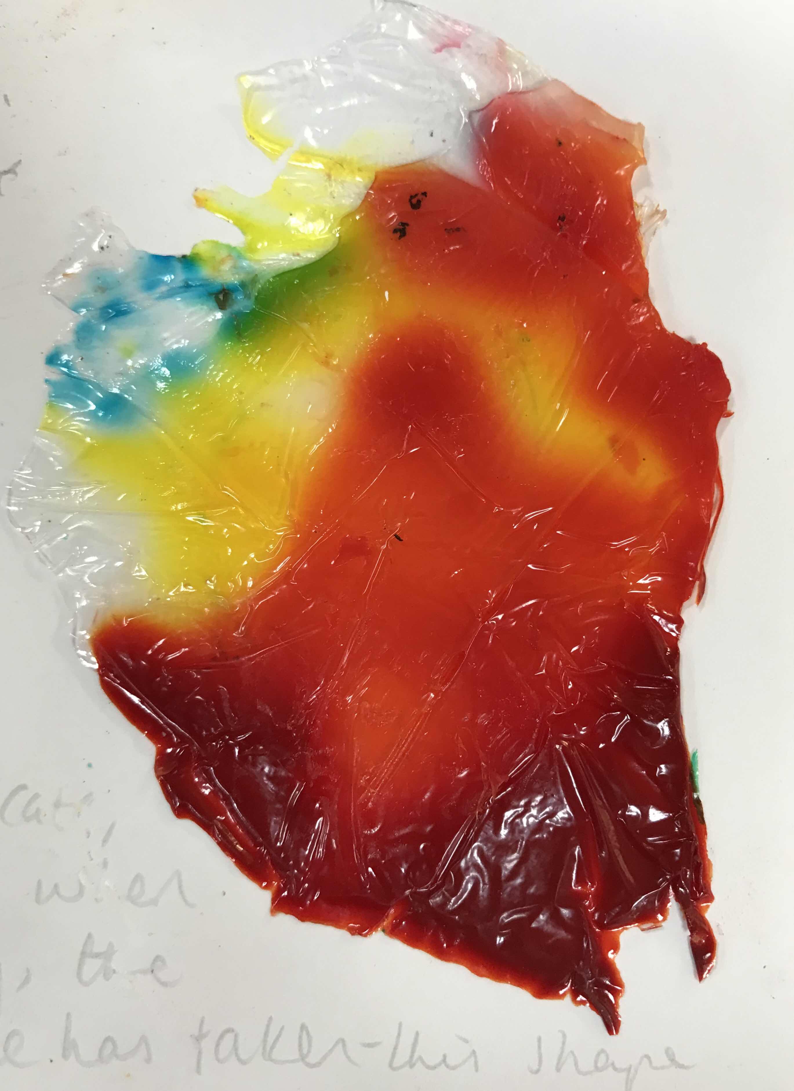
Furthermore, I have experimented the effect that using pva glue and ink together would make. I poured pva glue onto cling film and then poured ink in small quantities onto the glue. This took a couple of days to dry as the pva glue was quite thick. Once it was dry I could peel the glue off the cling film and stick it to a desired surface. As the cling film is delicate, it’s shape is easily manipulated and so when I was transporting it to dry, creases were made in the cling film and therefore the glue has taken this shape whilst drying. I prefer the experiments that I did using red and yellow ink rather than green and blue as these colours are warmer and more clearly emphasise the vivid warmth of someone’s personality. Colour being vibrant is important so that I can display to the viewer how people emerge from their stereotypes and don’t abide by them.

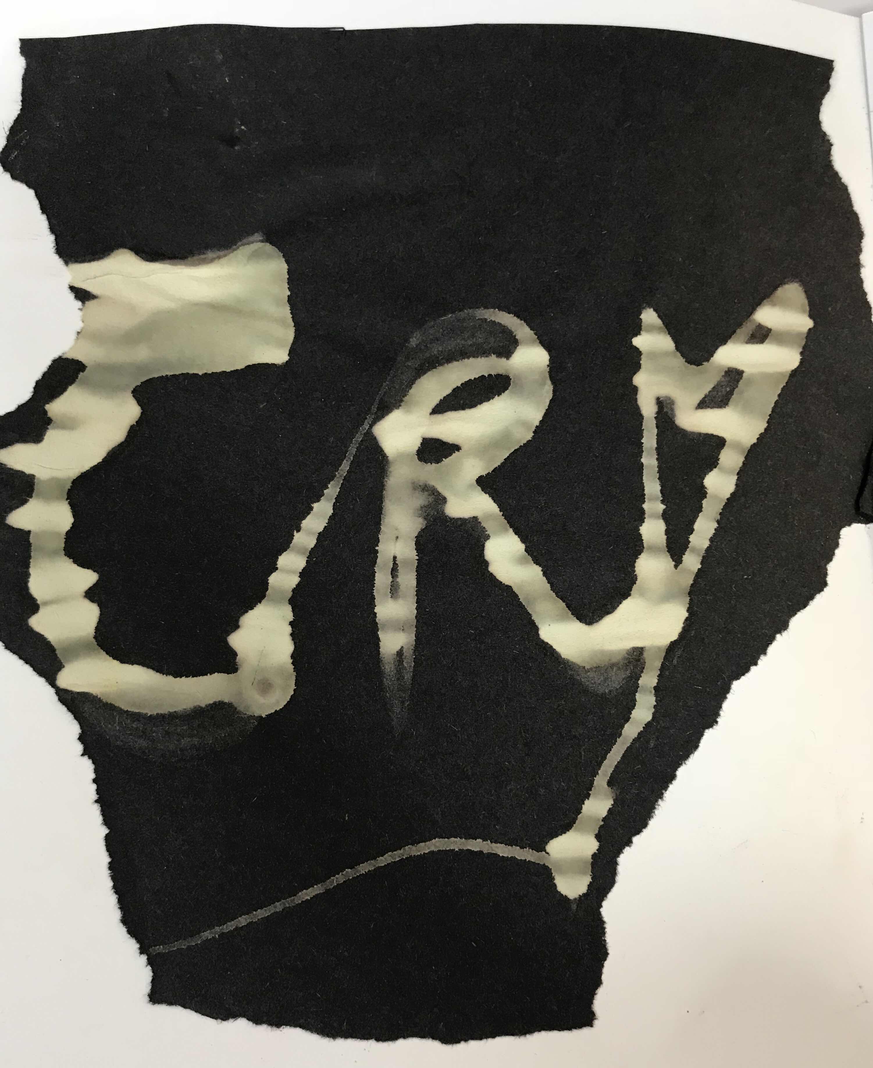
Moreover I have explored the reductive process by using bleach as this removes any dye from surfaces. I have experimented using bleach onto surfaces like fabric and sugar paper. Firstly I put bleach onto fabric to see what effect it would have on it. The area where the bleach was applied has become yellow/orange with is prominent against the original grey of the fabric. After viewing how bleach worked on the fabric, I tried to manipulate the bleach to spell out a word that is relevant to my theme. I chose the word ‘cry’ as it is short and can easily be written onto small experiments. Using ‘cry’ displays how I am trying to convey how men should feel that they are able to show their emotion without feeling ashamed. Also I have used this word in several other experiments which allows me to compare it to other techniques that I have previously used. When I put the bleach onto the fabric by pouring it slowly out of a pot, the line was very thin, however the fabric absorbed the bleach and so it has become thicker whilst drying. I therefore has little control over line thickness when working onto fabric. Conversely, when forming the word again onto sugarpaper the line was the same thickness as when I applied it as this surface is less absorbent. The bleach has turned the black sugar paper a tint of green. Within the lettering there is a lot of tonal variation where the paper has absorbed the bleach in different amounts. I chose the use continuous line when writing ‘cry’ to represent how this emotion should be freely expressed without care towards people mocking you for defying the ‘masculine’ stereotype of not crying in public.


No comments:
Post a Comment