Catling has done a series of compositions which include people in the photographs. In this experiment I have cut out two figures of people so that I could stick patterned wallpaper beneath it. Doing this represents the individual's colourful, vibrant personality that you don't see when passing a stranger in the street. This is therefore emphasising how people are quick to judge someone based on their appearance. This composition accentuates a person's private self which is bright and interesting through the application of rich colours in the background. The amount of colour in this composition is sparse and so this focusses the attention to the figures as the colours are striking against the tonal photograph. Additionally, in terms of shape, this composition is quite rectangular due to the features of the building. This rigid nature reflects the structure of a stereotype and how they can be hard to shatter. As the people are different shapes it shows us how our society is diverse and doesn't align with these geometric structures that are surrounding us. Therefore, we shouldn't try to make people fit into groups and stereotype them as we were born as individuals.

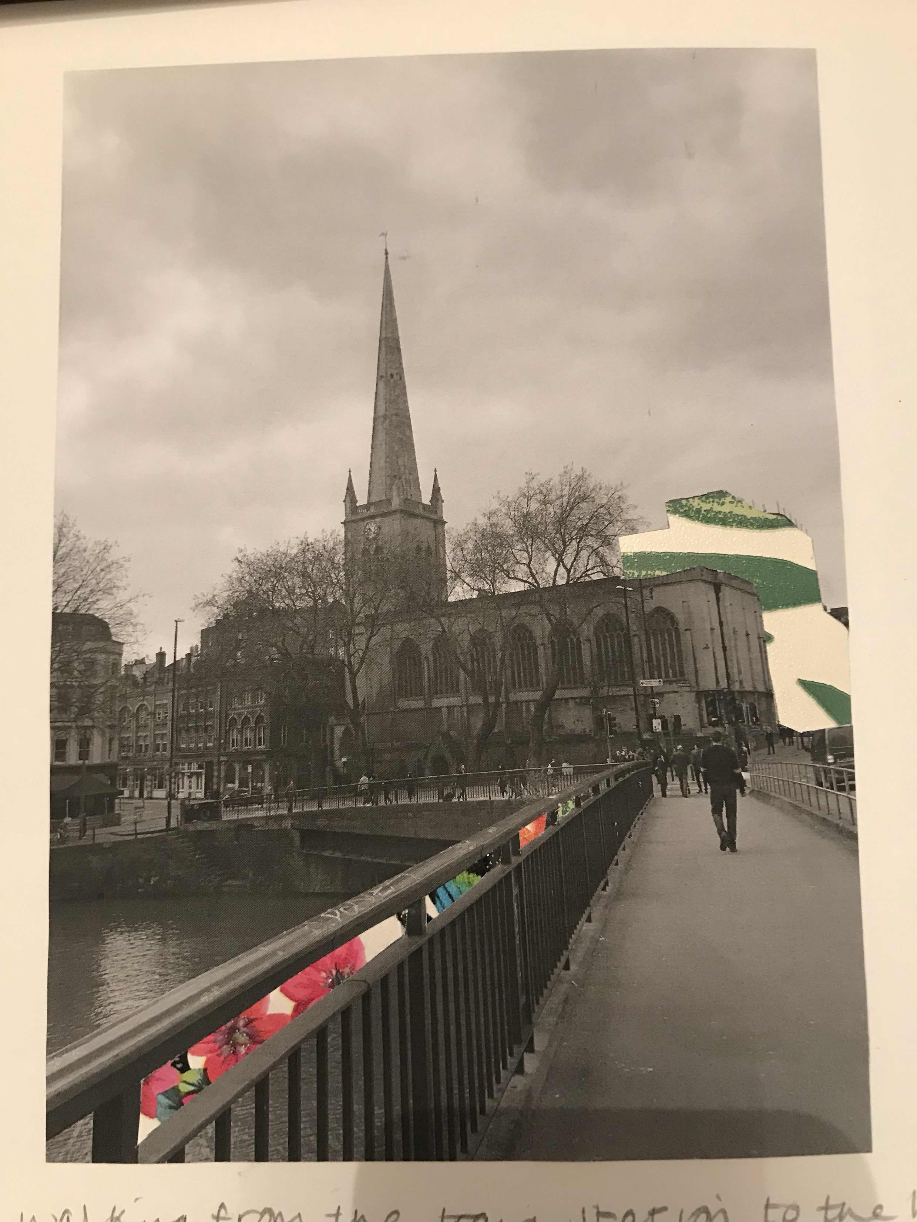
Whilst walking from the train station to the hotel, we walked past the church that is in the photograph. This stood out as the spire was so immense and the shape of this was completely different to the other buildings. As this caught my eye, I wanted to draw the viewer's eye to the church, especially as I don't see many churches with spires and was so fixated on it. To do this I have removed the hollow parts between the railings on the bridge and put wallpaper behind them so that the colour and direction leads the eye up the composition. I first stuck a bright pink wallpaper behind it so that this rich colour draws attention, then I added blue to contrast the colour palettes in terms of hot and cold colours. Following this I used orange to contrast the blue and then a green to create a unity between all the sections as some parts have hints of green in. As the shape of the church on the right had been lost due to the photograph being quite dark, I wanted to emphasise the size of it and so I removed the building behind it. I chose to line it with green wallpaper so that the green in the railings was continued up to the church, therefore leading the viewer's eye that way. I have thoroughly thought about my placements in colour and I think that I have been able to focus the viewer's eye well whilst doing so. As well as using colour, this formed a line upwards towards the church and so this created a movement in which the eye would follow. Therefore my application of colour has also formed line. There isn't too much colour in this composition, I think I have struck a balance between colours and shades as there is just enough colour to have an impact on the viewer without overwhelming the piece.

No comments:
Post a Comment